On this page
Choosing the right resume font is one of the most effective ways to make a strong first impression. Fonts can communicate credibility and personality, support professionalism, and give an application the best chance of passing Applicant Tracking System (ATS) screening and reaching the hiring managers.
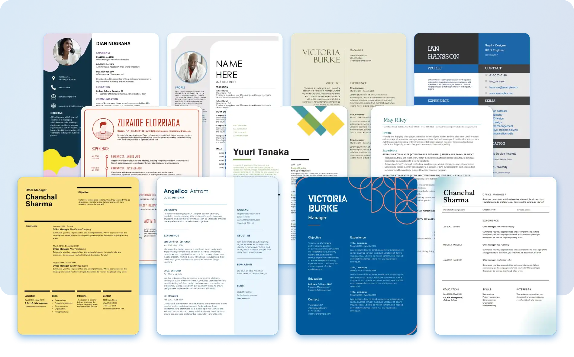
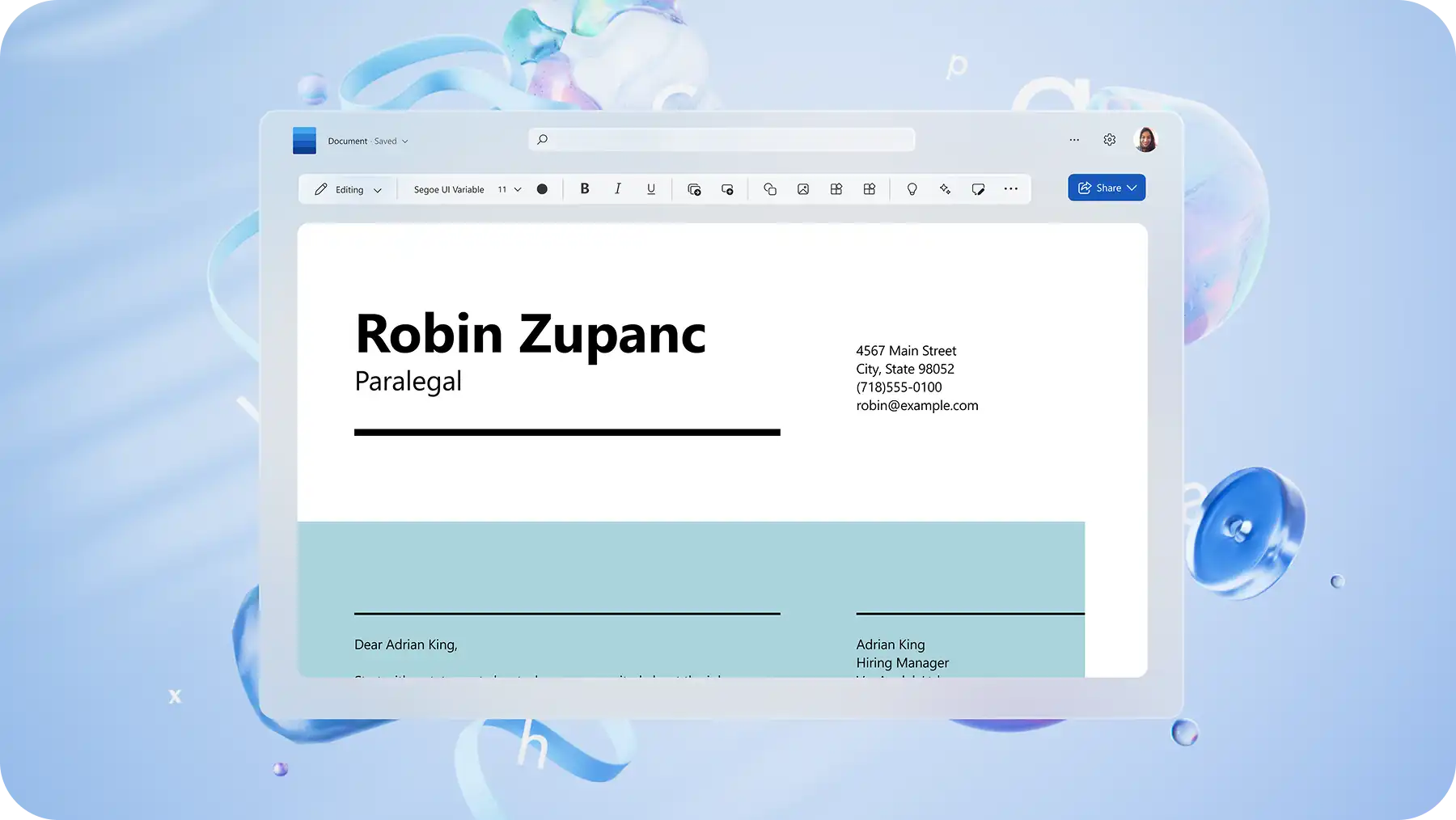
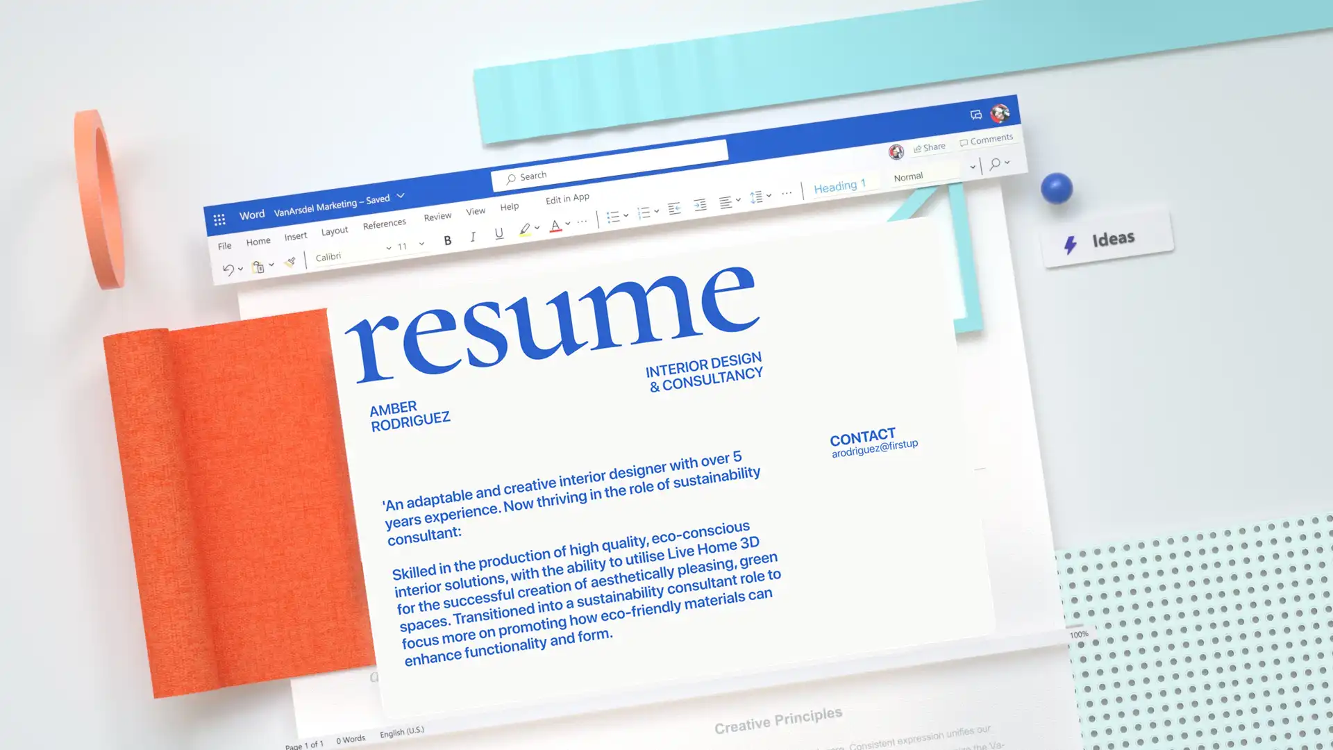
Discover practical tips on font styles, sizes, and other resume formatting best practices. Get started with the online resume builder with ready-to-use templates that include pre-formatted fonts and sizes. Create a resume that stands out at every stage of the hiring process with Microsoft Word.
The six best resume fonts for any job application
The best resume font does more than look good on the page. Font choice shapes how a resume is read, ranked, and remembered. Here are the top ATS-friendly resume fonts available online and in desktop with Microsoft Word.
1. Calibri font
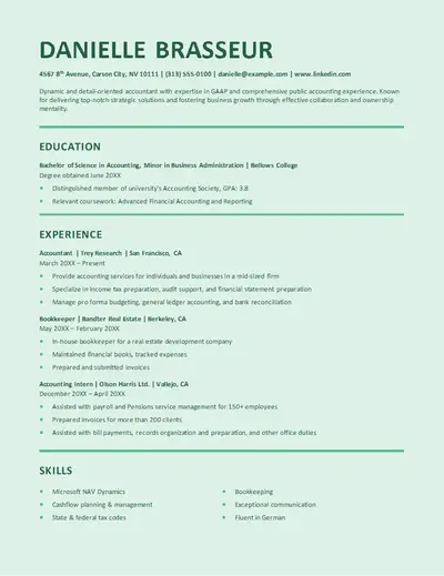
A modern sans serif font, Calibri has become the corporate gold standard. Simple to read, Calibri exudes professionalism and authority. With bold and light styles, this sans-serif font is easily adaptable to suit any impression. A great fit for careers like law, finance, and healthcare, Calibri suits any role where a clean, professional presentation is the priority.
2. Garamond font
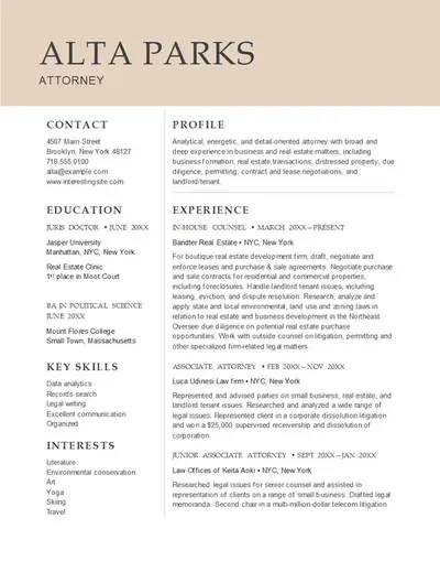
A classic serif font, Garamond is a trusted choice in professional publishing and formal documents. The font is easy to read at smaller sizes, giving a resume an authoritative and refined look. Garamond is a strong choice for roles in academia, publishing, law, and executive positions where a traditional, high-credibility presentation is valued.
3. Montserrat font
Montserrat brings an approachable, urban energy to a resume. A go-to typeface for print advertising and urban street signs, Montserrat is a natural fit for resumes in creative fields, wellness, and real estate. This sans-serif font has a bold feel while being extremely clear and scannable.
4. Candara font
Candara is a subtly stylish option that looks polished without being overly formal. Easy to read with a distinctive style, this font suits resumes that are less text heavy like a combination resume format and works especially well for internship, software, and IT roles.
5. Cambria font
Cambria is a traditional, balanced serif font that conveys reliability and professionalism. Designed for easy on-screen reading in small text sizes, Cambria is an ATS-friendly option that suits any resume. This serif font works well for management, human resources, and leadership roles, and is a strong choice for engineering and architecture resumes as the design supports math and science symbols. Explore resume formats to find the right structure to pair with Cambria.
6. Aptos font
Aptos is the default font in Microsoft Word and Microsoft 365, replacing Calibri as the modern standard. Designed for readability on modern screens with a warmer, more neutral tone, Aptos is a flexible sans-serif font that adapts across headings and body text. This ATS-friendly font is well-suited to technology, healthcare, and management applications.
How to choose a professional resume font
With a shortlist of ATS-friendly fonts selected, the next step is finding the right match for the job application. Choosing the right font based on the job role and seniority level involves understanding the cultural and professional nuances of each job sector, as well as the impression it needs to make on potential employers. Here are some guidelines to help find the best font.
Consider the job role and level
Different job roles and seniority levels can influence how creative or formal a resume design and resume font should be. Consider the seniority level of the role, entry-level, mid-level, or senior, as this determines how much creative liberty the font choice can take.
For example: Calibri could match a managerial job application, but another font like Montserrat might be able to convey more authority. Consider the impression the role calls for.
Consider the field of work
Each profession and field of work comes with its own set of values and expectations. Resumes created for formal fields of work such as law, medicine, government, and finance should convey reliability and professionalism, so fonts like Aptos and Calibri are a natural fit.
For example: a resume for a position at a law firm suits a traditional serif font like Garamond or Cambria, while a role at a creative agency might call for something slightly more relaxed, like Montserrat.
Evaluate existing experience
A resume must highlight relevant skills and experience clearly. The font should complement the content, not compete with it. If the resume is text-heavy, consider a simple font that is easy to scan. If it’s shorter or uses more bullet points than paragraphs, there is more creative liberty. Not sure how to present experience concisely? The AI rewriter in Word can help tighten and refine resume content before choosing a font.
For example: a resume with extensive work history and detailed achievements reads best in a clean font like Calibri or Aptos. A shorter, skills-led resume may have more room for a font with personality, like Candara.
Think about personal branding
A resume font is an opportunity to showcase personality and stand out from other applicants. Font choice is a subtle but effective form of personal branding that signals character and style before a single word is read. Search for a font that aligns with that professional identity.
For example: a senior marketing candidate might choose Montserrat to signal creativity and confidence, while someone in finance might opt for Cambria to project authority and stability.

Ideal font size and ATS-friendly formatting for resumes
Change the font size in a resume to help draw the recruiter's eye to the most important skills and achievements. Always prioritize readability and follow these general guidelines when creating a resume from scratch.
Name font size: use a larger font size, typically 18 to 24 points, to spotlight a name. The right size will depend on the overall resume design, but it should stand out immediately.
Section headings font size: use 12 to 14 points in bold styling to make sure resume headings make an impact.
Body text font size: use ten to 12 points to ensure clarity throughout the resume.
Bullet points: use ten to 11 points to list any skills, achievements, certificates, or nice-to-have information. If you’re not sure what other information to add, explore how to write a resume quickly with AI.
Use an ATS-friendly resume format: a single-column layout with standard margins, consistent line spacing, and heading styles for section titles gives ATS software the best chance of reading a resume accurately.
Short on time? Start with a pre-formatted, ATS-ready resume template in Word, then use Copilot to refine and tailor the content to suit the job.
Mistakes to avoid when formatting a resume
On a resume, formatting is just as important as the content itself. These are the most common resume font mistakes and ATS formatting issues to address before submitting.
Avoid overly decorative resume fonts
Fonts like Comic Sans and other over-stylized fonts can appear unprofessional and are harder for ATS software to scan accurately, reducing the chance of reaching a recruiter.
Don't use multiple fonts within one resume
Using more than two fonts creates visual inconsistency and reduces readability. Choose one primary font for body text and, if needed, a second for the name or section headings. Keep styling cohesive throughout.
Check for consistent spacing
Inconsistent line spacing or uneven margins make a resume harder to read and can disrupt ATS scanning. Use standard line spacing and margins throughout any resume. ATS software reads content from left-to-right, so a clean single-column layout is the most reliable structure.
Avoid formatting that isn't compatible with ATS software
Most ATS software struggles to interpret content stored in tables, text boxes, headers, footers, or graphics. Keep all important information in the main body of the document. Follow these formatting rules below.
Don't use italics styling for any important information.
Don't underline resume text.
Don’t create tables as ATS software cannot reliably interpret the layout.
Don't use icons or graphics to indicate skills. Simply use text.
Don't use more than two fonts to maintain readability.

The right font and formatting help a resume meet ATS requirements and make a strong impression on recruiters. Start from scratch or choose from professionally designed templates using the resume builder in Word. A strong resume deserves an equally strong cover letter. Learn how to write a cover letter and how to format a cover letter to complete the application.
Frequently asked questions
What CV and resume fonts to avoid?
Fonts like Comic Sans, Papyrus, and other over-stylized or script typefaces can appear unprofessional and are difficult for ATS software to scan accurately. Avoid decorative fonts that prioritize style over clarity. Stick to clean, widely supported options like Calibri, Garamond, or Aptos, all available in the resume builder in Word.
Are serif fonts or sans-serif fonts better for resumes?
The right font style depends on the profession and personal preference. Sans-serif fonts like Calibri and Aptos offer a clean, modern look, while serif fonts like Garamond and Cambria carry a more traditional, authoritative feel. It's worth noting that additional strokes in some decorative serif fonts can make it harder for ATS software to scan a resume, so it's best to stick to easy-to-read options. Explore resume templates in Word to see both serif and sans-serif fonts in action.
What is the best font for a resume and CV?
The best resume fonts are Calibri, Garamond, Montserrat, Candara, Cambria, and Aptos, each offering a professional and modern look, strong readability, and ATS compatibility across any job type or role.
Resume templates in Word come pre-formatted with the best fonts for any job application. For a more tailored approach, Copilot in Word can help suggest the best font and format to suit a specific role. Complete the application with a polished cover letter.
How to edit a resume font and font size in Word?
Open a resume in Word, select the text to update, and use the font dropdown on the home tab to choose a new font. Adjust the text size using the font size field beside it. To update all headings or body text at once, right‑click the relevant style in the styles gallery and select modify. The change applies automatically throughout the document. For more ways to edit and format documents in Word, explore document editor.